Material Design Lite Cards
what is cards in (MDL) ?
- The MDL component cards is used to create a virtual card to contain images, text, links related to any single topic.
- MDL Cards makes it very easy to display related content side by side, like photographs with captions and some support actions.
- Depending upon the type of Content the size of the cards can be set along with other display features.
Anatomy of MDL Card Component:
- A Card is created by using class "mdl-card" within the main element. Additional elements can be defined within this main element.
- The Title of the card is defined using class "mdl-card__title"
- A Container for the media within the card is defined using class "mdl-card__media"
- The Supporting text describing the content is defined using the class "mdl-card__supporting-text"
- Any Action elements on the card, say a link, is defined using class "mdl-card__actions".
Syntax :
<div class="mdl-card"> <!-- the main card container, using class "mdl-card"-->

  <div class="mdl-card__title">
  ...  <!-- To Define the Title of the Card, using class "mdl-card__title"-->
  </div>

  <div class="mdl-card__media">
  ... <!-- Container to hold media items , using class "mdl-card__media"-->
  </div>

  <div class="mdl-card__supporting-text">
  ...  <!-- To Insert Support Text , using class "mdl-card__supporting-text"-->
  </div>

  <div class="mdl-card__actions">
  ... <!-- To hold additional action elements , using class "mdl-card__actions"-->
  </div>
</div>
Creating a Card:
- A Basic Google MDL card component is created using class .mdl-card as a container
Sample code:
<div class="mdl-card"> <!-- card container, using class="mdl-card" -->

  <div class="mdl-card__media"><img src="tintin.jpg" width="303"
    height="200" border="0"  alt="" style="padding:10px;">
  <!-- MDL Media container in the Card component, using class="mdl-card__media" -->
  </div>

  <div class="mdl-card__supporting-text">  <!-- MDL Card support Text -->
  Adventutes of Tintin <br>
  An Animated Series of Adventure Films
  </div>

  </div> <!-- End of .mdl-card Class -->
Card with Additional Elements:
- A MDL card with a shadow display is created using class mdl-shadow-Xdp , value of X can be 2, 3, 4, 6, 8 or 16
Sample code:
<div class="demo-card mdl-card mdl-shadow--4dp">

   <!-- MDL Card Title using class ".mdl-card__title"-->
  <div class="mdl-card__title mdl-card--expand">
    <h2 class="mdl-card__title-text">Adventures of Tintin</h2>
  </div>

   <!-- Support Text using class "mdl-card__supporting-text"-->
  <div class="mdl-card__supporting-text">
    Adventures of Tintin with Journalist(Tintin) and His Dog (Snowy)
  </div>

   <!-- Action Elements using class "mdl-card__actions"-->
  <div class="mdl-card__actions mdl-card--border">
    <!-- Border added using class "mdl-card--border"-->

    <a class="mdl-button mdl-button--colored mdl-js-button mdl-js-ripple-effect">
      <!-- Button with ripple Effect-->
      $9.99 Buy Now
    </a>

  </div> <!-- .mdl-card-->
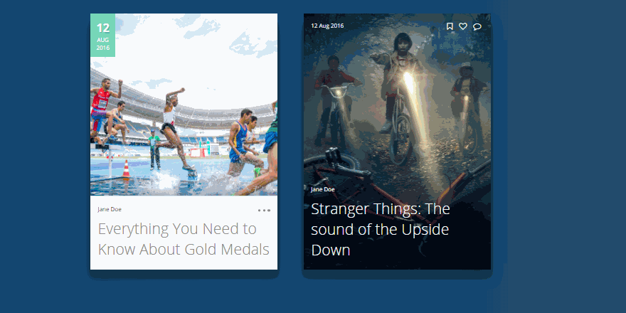
Image Card:
- An MDL Card component can be used to create an Image Card as well, by setting an Image as the Background and applying other CSS style effects.
Sample code:
<div class="demo-card-image mdl-card mdl-shadow--4dp">

    <!-- MDL Card Title, using class "mdl-card__title" -->
  <div class="mdl-card__title mdl-card--expand"></div>
         <!-- MDL Card Actions  -->
  <div class="mdl-card__actions">
        <!-- MDL Card Image Names -->
  <span class="demo-card-image__filename">TINTIN.jpg</span>
  </div>
       </div>
Address Card:
- The MDL card component can be used to create an Address Card as well.
Sample code:
<div class=" mdl-card mdl-shadow--4dp">

  <div class="mdl-card__title">  <!-- title -->
   <i class="material-icons">home</i>
    <h4>
     Mr Harry<br>
     21A Baker Street<br>
     US
    </h4>
  </div>

</div>

     <!-- Card 2-->
  <div class=" mdl-card mdl-shadow--4dp" style="background:#fa4b2a;">

  <div class="mdl-card__title"> <!-- title -->
   <i class="material-icons">home</i>
    <h4>
     Mr Venkat<br>
     MI-6 HeadQuarters<br>
    UK
    </h4>
  </div>

</div>
Very Wide Card:
- A wider MDL Card can be created by using CSS styles to set the width of the class mdl-card
Sample code:
<div class="demo-card-wide mdl-card mdl-shadow--8dp">
     <!-- MDL Card Container -->

      <div class="mdl-card__title">
        <!-- MDL Card Title container -->
        <h2 class="mdl-card__title-text">The Adventures of Tintin</h2>
                 <!-- title text -->
      </div>

     <!-- Supporting Text -->
      <div class="mdl-card__supporting-text">
       A Series of Animated Adventure Films. Lead Characters
       are Tintin(A Journalist) and Snowy(dog)
      </div>

     <!-- Border and Action Elements -->
      <div class="mdl-card__actions mdl-card--border">
        <a class="mdl-button mdl-button--colored mdl-js-button mdl-js-ripple-effect">
          $9.99 Buy Now
        </a>
      </div>

     <!-- Menu button with Effects -->
      <div class="mdl-card__menu">
        <button class="mdl-button mdl-button--icon mdl-js-button mdl-js-ripple-effect">
          <i class="material-icons">event</i>
        </button>
      </div>
     </div>
Material Design Lite : Classes
| MDL Class | Description |
|---|---|
| mdl-card | To Define any div element as an MDL Card Component Container. |
| mdl-card--border | To Add a Border within card sections. |
| mdl-shadow--Xdp | To apply shadow with variable depth defined by value of X, X can be 2, 3, 4, 6, 8 or 16 |
| mdl-card__title | To Define the title container within any div |
| mdl-card__title-text | To apply text charactersitics to the title of MDL card, H1-H6 |
| mdl-card_subtitle-text | To apply text charactersitics to the sub-title of MDL card |
| mdl-card__media | To Define a div element as a media container |
| mdl-card__supporting-text | To Define a div element as a container for supporting text. |
| mdl-card__actions | To define a div element as a container of the action element |
This material design lite tutorial provides you the basics on the following areas android material design , google material design , material ui , google design , amg lite , bootstrap material design , mdl , materialize css , cool material , material design list , material design website , material design cards , material design ui , material design web , material design apps , material design tutorial , angular material design , material design table , material design angular , material design examples , material design theme , material design animation , material design css , what is material design , material design framework , material design buttons , material design template , material design components , google material design colors , material design google , material design light
World's No 1 Animated self learning Website with Informative tutorials explaining the code and the choices behind it all.
© 2016 - 2026 KaaShiv InfoTech, All rights reserved. Powered by Inplant Training in chennai | Internship in chennai