Material Design Lite Text Field
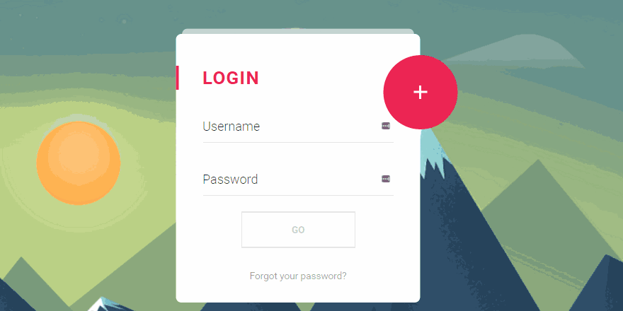
what is text field in (MDL) ?
- Material Design Lite(MDL) component text field is used to create an input field, it’s an enhanced version of HTML5 <input type="text"> and <input type="textarea">
- A textfield comprises
- Tables find usage in almost all types of webpages to display structured data, hence the design and placement of tables has a huge impact on user experience.
- The MDL tooltip has predefined colors, fonts and other UI details to provide a visually attractive tooltip displaying related content.
- The Use of tooltip on a Webpage greatly improves the user experience by providing additional information in limited space and reducing the need to navigate to new page for details
Material Design Lite(MDL) Text Field: Simple Text Field
- A Simple MDL textfield is created using class mdl-textfield to create a container for holding text field elements
- The Input field is created using class mdl-textfield__input, the attribute type is used to assign the input type, i.e text input, number input etc.
- The label displayed within the input field is displayed using class mdl-textfield__error
Sample Code for Simple Text Field
<form action="#">
<!-- class "mdl-textfield container" -->
<div class="mdl-textfield mdl-js-textfield">

<!-- class "mdl-textfield__input" -->
<input class="mdl-textfield__input" type="text" id="demo-input" />

<!-- class "mdl-textfield__label" -->
<label class="mdl-textfield__label" for="demo-input">UserName..</label>
</div>
</form>
- Note: The Value of attribute id must be same as the value of attribute for
Material Design Lite(MDL) Input: Numeric TextField
- A MDL Numeric TextField is created using class mdl-textfield__input with a regex-pattern
- The Error Message is displayed using the class mdl-textfield__error, which displays the error message when the input does not conform to the regular expression.
Sample Code for Numeric TextField
<form action="#">
<div class="mdl-textfield mdl-js-textfield">

<!-- input pattern attribute -->
<input class="mdl-textfield__input" type="text" pattern="-?[0-9]*(\.[0-9]+)?" id="demo-input" />

<!-- mdl-textfield__label -->
<label class="mdl-textfield__label" for="demo-input">Phone Number</label>

<!-- class "mdl-textfield__error" -->
<span class="mdl-textfield__error">Input is not a phone number</span>

</div>
</form>
- Note:The value of attribute for and id must be same.
Material Design Lite(MDL) Text Input : Floating Text Field
- A Floating Text Field label is created using class mdl-textfield--floating-label , as soon as the cusor is activated the label floats above the input.
Sample code for Floating TextField
<form action="#">

<!-- class "mdl-textfield container" -->
<div class="mdl-textfield mdl-js-textfield mdl-textfield--floating-label">

<!-- class "mdl-textfield__input" -->
<input class="mdl-textfield__input" type="text" id="demo-input" />

<!-- class "mdl-textfield__label" -->
<label class="mdl-textfield__label" for="demo-input">UserName..</label>

</div>
</form>
- Note: The Floating label is useful to provide hints to the user even providing inputs.
Material Design Lite(MDL) Text Inputs : Floating Number Fields
- A MDL text Input with Floating number Fields using class mdl-textfield--floating-label with attribute pattern to add a regex-pattern.
Sample Code for Floating Number Field
<form action="#">

<!-- floating label -->
<div class="mdl-textfield mdl-js-textfield mdl-textfield--floating-label">

<!-- input pattern attribute -->
<input class="mdl-textfield__input" type="text" pattern="-?[0-9]*(\.[0-9]+)?" id="demo-input" />

<!-- mdl-textfield__label -->
<label class="mdl-textfield__label" for="demo-input">Phone Number</label>

<!-- class "mdl-textfield__error" -->
<span class="mdl-textfield__error">Input is not a phone number</span>

</div>
</form>
- Note: The Error Message is displayed if the input does not validate the regex-pattern(i.e only number)
Material Design Lite(MDL) TextInput : Expandable Text Field
- A MDL Text Input with Expandable Text Field is created using class mdl-textfield--expandable.
Sample Code for Expandable TextField
<form action="#">
<!-- MDL class "mdl-textfield--expandable"-->
<div class="mdl-textfield mdl-js-textfield mdl-textfield--expandable">

<label class="mdl-button mdl-js-button mdl-button--icon" for="sample-input">
<i class="material-icons">search</i>
</label>

<!-- Expandable textfield Container -->
<div class="mdl-textfield__expandable-holder">
<input class="mdl-textfield__input" type="text" id="sample-input" />
<label class="mdl-textfield__label" for="sample-input">Expandable Input</label>
</div>

</div>
</form>
- Note:The Expandable text field is usable for search options.
Material Design Lite: MDL Textfield Classes
| MDL Class | Description |
|---|---|
| mdl-textfield | To create a MDL textfield container |
| mdl-js-textfield | To Assign basic MDL behaviour to text input |
| mdl-textfield__input | To define a textfield input |
| mdl-textfield__label | To Define an element with input textfield |
| mdl-textfield--floating-label | To apply a floating label effect . |
| mdl-textfield__error | To create an error message for MDL text field |
| mdl-textfield--expandable | To create an Expandable MDL text field Container |
| mdl-button | To Set a Label as MDL Icon Button |
| mdl-js-button | To assign basic behaviour to MDL icon container |
| mdl-button--icon | To Define an MDL icon container |
| mdl-input__expandable-holder | To Define a container for expandable MDL component |