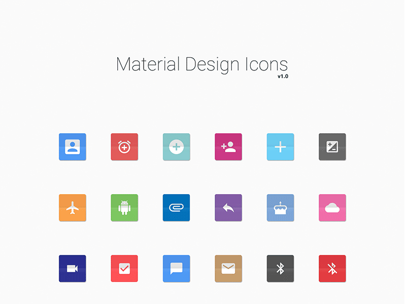
Material Design Lite Icons
what is Icons in (MDL) ?
- Material Design Lite(MDL) Provides a huge set of Icons which are attractive and easy to use on your Webpages.
- All Material Design Lite(MDL) icons are the open source and can be downloaded or used via CDN hosted on google Servers.
- The below table mentions the available classes and their effects.
| S.N. | Class Name & Description |
|---|---|
| 1 | mdl-icon-toggle Identifies label as an MDL component and is required on label element. |
| 2 | mdl-js-icon-toggle Sets basic MDL behavior to label and is required on label element. |
| 3 | mdl-icon-toggle__input Sets basic MDL behavior to icon-toggle and is required on input element (icon-toggle). |
| 4 | mdl-icon-toggle__label Sets basic MDL behavior to caption and is required on on i element (icon). |
| 5 | mdl-js-ripple-effect Sets ripple click effect and is optional; goes on label element, not input element (icon-toggle). |
Sample Code:
- The following example is coding for the use of mdl-icon-toggle classes to show different types of checkboxes as icons.
<html>
<head>
   <script src="https://storage.googleapis.com/code.getmdl.io/1.0.6/material.min.js"></script>
   <link rel="stylesheet" href="https://storage.googleapis.com/code.getmdl.io/1.0.6/material.indigo-pink.min.css">
   <link rel="stylesheet" href="https://fonts.googleapis.com/icon?family=Material+Icons">
</head>
<body>
   <table>
      <tr><td>On Icon</td><td>Off Icon</td><td>Disabled Icon</td></tr>
      <tr><td>
         <label class="mdl-icon-toggle mdl-js-icon-toggle mdl-js-ripple-effect" for="icon-toggle-1">
            <input type="checkbox" id="icon-toggle-1" class="mdl-icon-toggle__input" checked>
            <i class="mdl-icon-toggle__label material-icons">format_bold</i>
         </label>
	  </td>
      <td>
         <label class="mdl-icon-toggle mdl-js-icon-toggle mdl-js-ripple-effect" for="icon-toggle-2">
            <input type="checkbox" id="icon-toggle-2" class="mdl-icon-toggle__input">
            <i class="mdl-icon-toggle__label material-icons">format_italic</i>
         </label>
	  </td>
       <td>
         <label class="mdl-icon-toggle mdl-js-icon-toggle mdl-js-ripple-effect" for="icon-toggle-2">
            <input type="checkbox" id="icon-toggle-2" class="mdl-icon-toggle__input" disabled>
            <i class="mdl-icon-toggle__label material-icons">format_underline</i>
         </label>
	   </td>
      </tr>
   </table>
</body>
</html>