Google Charts - Google Charts tutorial - Basic Donut Chart - chart js - google graphs - google charts examples
What is a donut chart used for?
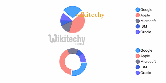
- Just like a pie chart , a doughnut chart shows the relationship of parts to a whole, but a doughnut chart can contain more than one data series.
- Each data series that you plot in a doughnut chart adds a ring to the chart.
- The first data series is displayed in the center of the chart.
Configurations:
- You have used pieHole configuration to set a pie chart as donus chart.
Syntax
// Set chart options
var options = {
   pieHole: 0.4
};
Clicking "Copy Code" button to copy the code. From - google charts tutorial - team
Learn Google chart - Google chart tutorial - Google chart examples - Google chart programs
Example
googlecharts-pie-donut.html
 Tryit<html>
<head>
<title>Google Charts Tutorial</title>
   <script type="text/javascript" src="https://www.gstatic.com/charts/loader.js"></script>
   <script type="text/javascript">
     google.charts.load('current', {packages: ['corechart']});
   </script>
</head>
<body>
<div id="container" style="width: 550px; height: 400px; margin: 0 auto"></div>
<script language="JavaScript">
function drawChart() {
   // Define the chart to be drawn.
   var data = new google.visualization.DataTable();
   data.addColumn('string', 'Browser');
   data.addColumn('number', 'Percentage');
   data.addRows([
      ['Firefox', 50.0],
      ['IE', 28.8],
      ['Chrome', 19.8],
	  ['Safari', 11.5],
      ['Opera', 7.2],
      ['Others', 0.9]
   ]);

   // Set chart options
   var options = {'title':'Browser market shares at a specific website, 2014',
      'width':550,
      'height':400,
       pieHole: 0.4
   };

   // Instantiate and draw the chart.
   var chart = new google.visualization.PieChart(document.getElementById('container'));
   chart.draw(data, options);
}
google.charts.setOnLoadCallback(drawChart);
</script>
</body>
</html>