html tutorial - <input> - Input Tag in HTML - html5 - html code - html form

Learn html - html tutorial - input tag in html - html examples - html programs
- The <input> tag is used to accept the data from the user.
- The <input> elements are used inside the <form> element.
- It is used to declare the input controls that allows user to enter the data.
- To depending on the type attribute, an input field can change in many different ways.
- The <input> tag supports the Global Attributes and Event Attribute.
Syntax for <input> tag:
<input>content</input>Differences between HTML 4.01 and HTML 5 for <input> tag:
HTML 4.0.1
- HTML 4 is supports ”align” attribute.
HTML 5
- HTML 5 is not support an “align” attribute.
- The <input> tag has several new attributes in HTML 5.
- The type attribute has several new values in HTML 5.
Sample Coding for <input> tag:
Tryit<!DOCTYPE html>
<html >
    <head>
        <title>Wikitechy input tag</title>
    </head>
    <body>
        <h2>input tag with example</h2>
        <form>
            First name:<br>
            <input type="text" name="FirstName" value="Wiki">
            <br>
            Last name:<br>
            <input type="text" name="LastName" value="techy">
            <br><br>
            <input type="submit" value="Submit">
        </form>
    </body>
</html>
Code Explanation for <input> tag:

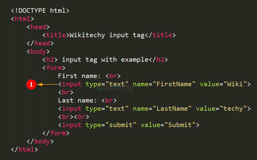
- The <input> tag is used to get the inputs from the user.
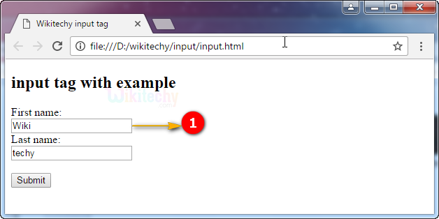
Output for <input> tag:

- The output shows the input textbox with the value “Wiki”.
Attributes of <input> tag:
| Attribute | Value | HTML4 | HTML5 | Description |
|---|---|---|---|---|
| accept | file_extension audio/* video/* image/* media_type |
Yes | Yes | It is used to specify more than one value. The values will be separate by using comma. |
| align | left right top middle bottom |
Yes | No | It is used to denotes the alignment of an image input. |
| maxlength | number | Yes | Yes | It Specifies the maximum number of characters allowed in an <input> element. |
| name | text | Yes | Yes | It Specifies the name of an <input> element. |
| value | text | Yes | Yes | It Specifies the value of an <input> element. |
| checked | checked | Yes | Yes | If type=”radio” or type=”checkbox” it will already be selected when the page loads. |
| disabled | disabled | Yes | Yes | Input control disable. The button won't accept changes from the user. It also can’t receive focus and will be skipped when tabbing. |
| alt | text | Yes | Yes | Defines an alternate text for images. |
| readonly | readonly | Yes | Yes | It Specifies that an input field is read-only. |
| size | number | Yes | Yes | It Specifies the width, in characters, of an <input> element. |
| src | URL | Yes | Yes | It Specifies the URL of the image to use as a submit button (only for type="image"). |
| type | button checkbox color date datetime datetime-local file hidden image month number password radio range reset search submit tel text time url week |
Yes | Yes | It Specifies the type <input> element to display |
| form | form_id | No | Yes | It specifies one or more forms. |
| formaction | URL | No | Yes | It denotes the URL of the file that will process the input control when the form is submitted. |
| formenctype | application/x-www-form-urlencoded multipart/form-data text/plain |
No | Yes | It specifies how the form-data should be encoded when submitting it to the serve. |
| formmethod | get post |
No | Yes | It defines the HTTP method for sending data to the action URL. |
| formnovalidate | formnovalidate | No | Yes | It defines that form elements should not be validated when submitted. |
| formtarget | _blank _self _parent _top framename |
No | Yes | It Specifies where to display the response that is received after submitting the form (for type="submit" and type="image"). |
| height | pixels | No | Yes | It Specifies the height of an <input> element (only for type="image"). |
| list | datalist_id | No | Yes | It refers to a <datalist> element that contains pre-defined options for an <input> element. |
| max | number date |
No | Yes | It Specifies the maximum value for an <input> element. |
| autocomplete | on off |
No | Yes | Defines whether an <input> element should have autocomplete enabled. |
| autofocus | autofocus | No | Yes | Denotes that <input> element should automatically get focus when the page loads. |
| min | number date |
No | Yes | It Specifies a minimum value for an <input> element. |
| multiple | multiple | No | Yes | It Specifies that a user can enter more than one value in an <input> element. |
| pattern | regexp | No | Yes | It Specifies a regular expression that an <input> element's value is checked against. |
| placeholder | text | No | Yes | It Specifies a short hint that describes the expected value of an <input> element. |
| required | required | No | Yes | It Specifies that an input field must be filled out before submitting the form. |
| step | number | No | Yes | It Specifies the legal number intervals for an input field. |
| width | pixels | No | Yes | It Specifies the width of an <input> element (only for type="image"). |
Browser Support for <input> tag in HTML:
| |
||||
|---|---|---|---|---|
| Yes | Yes | Yes | Yes | Yes |
